Camino Films
Client: Camino Films
Service: Rebranding
Art Direction: Corvina i Turbot
Creative Direction: Laura Diez
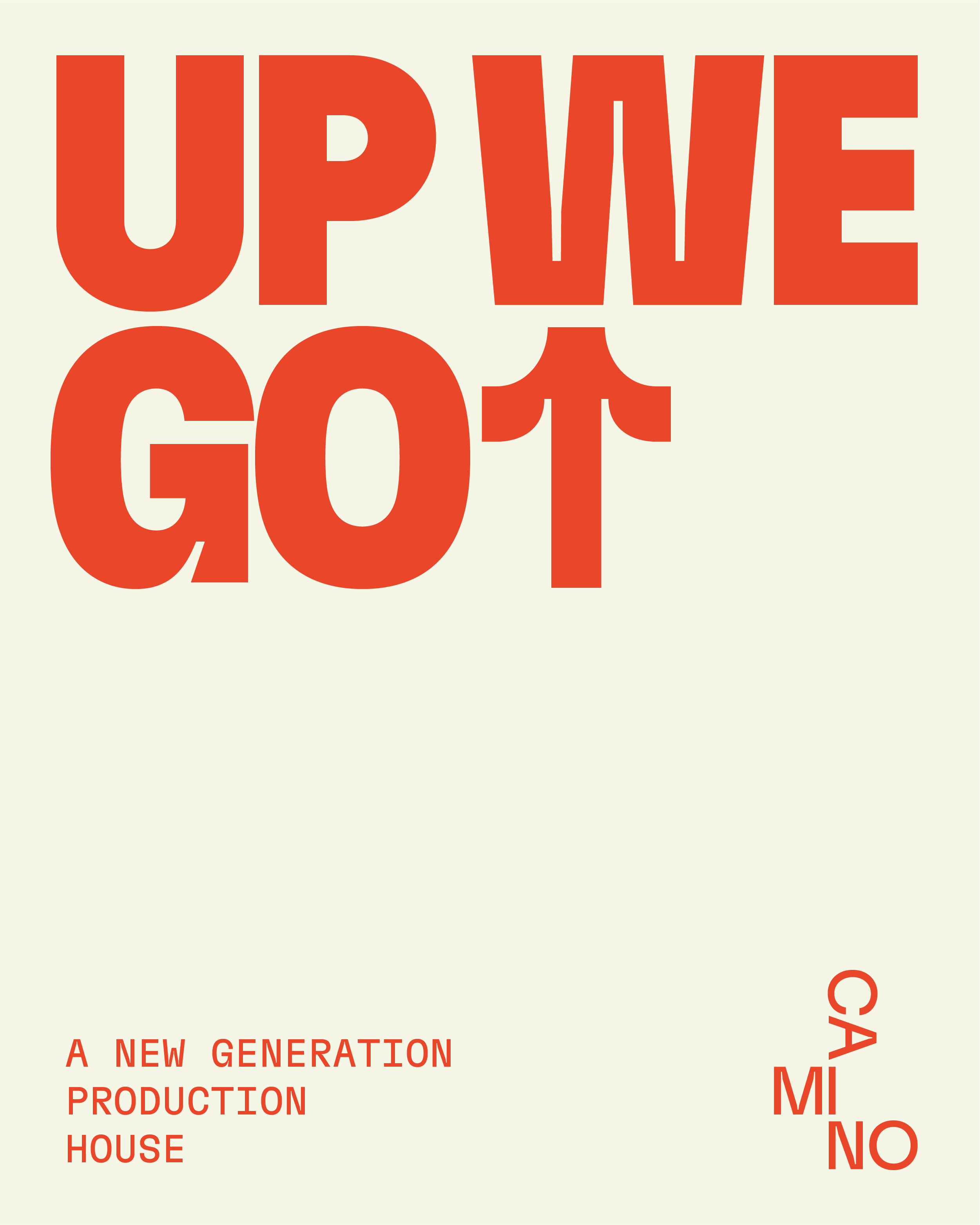
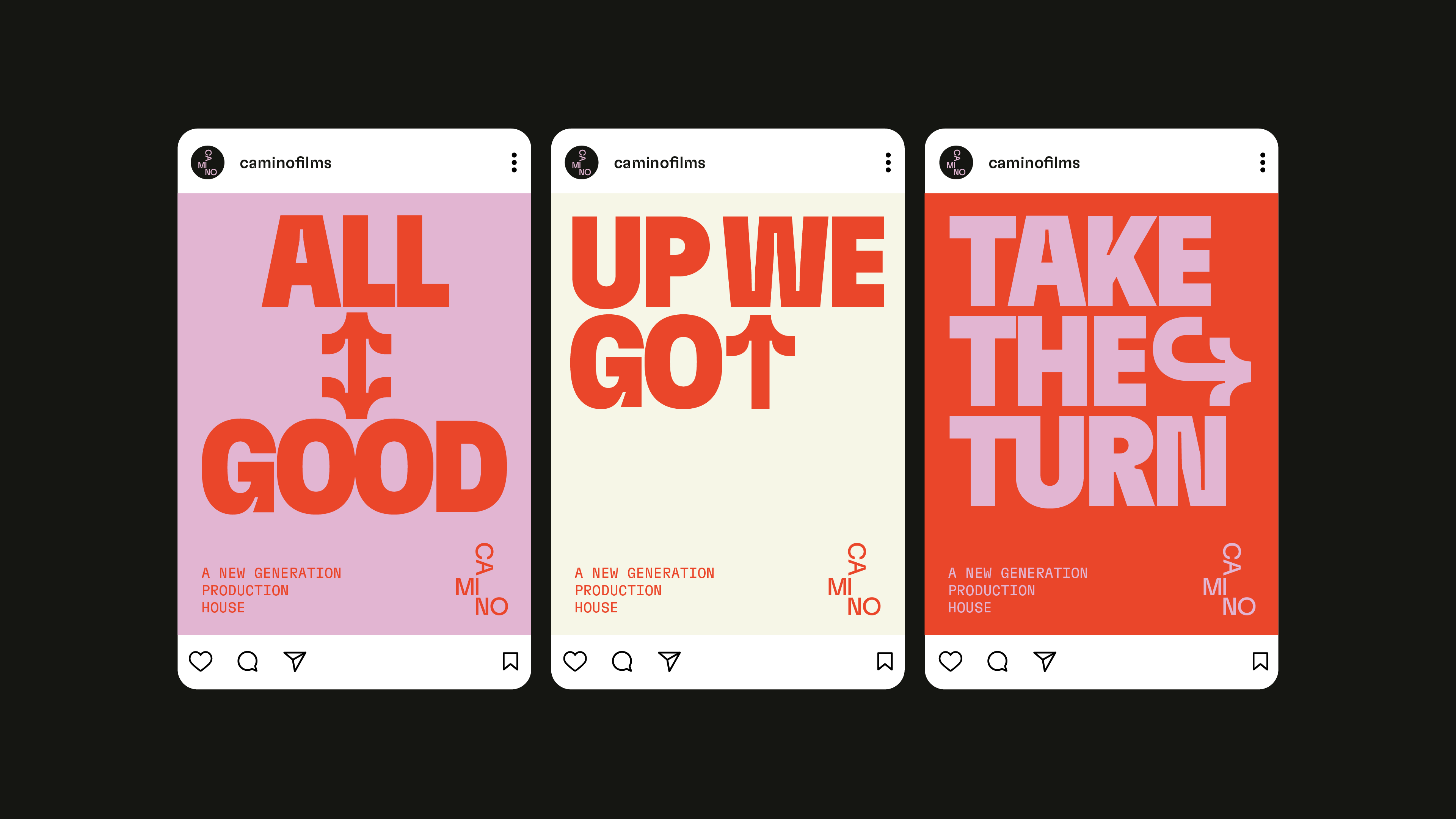
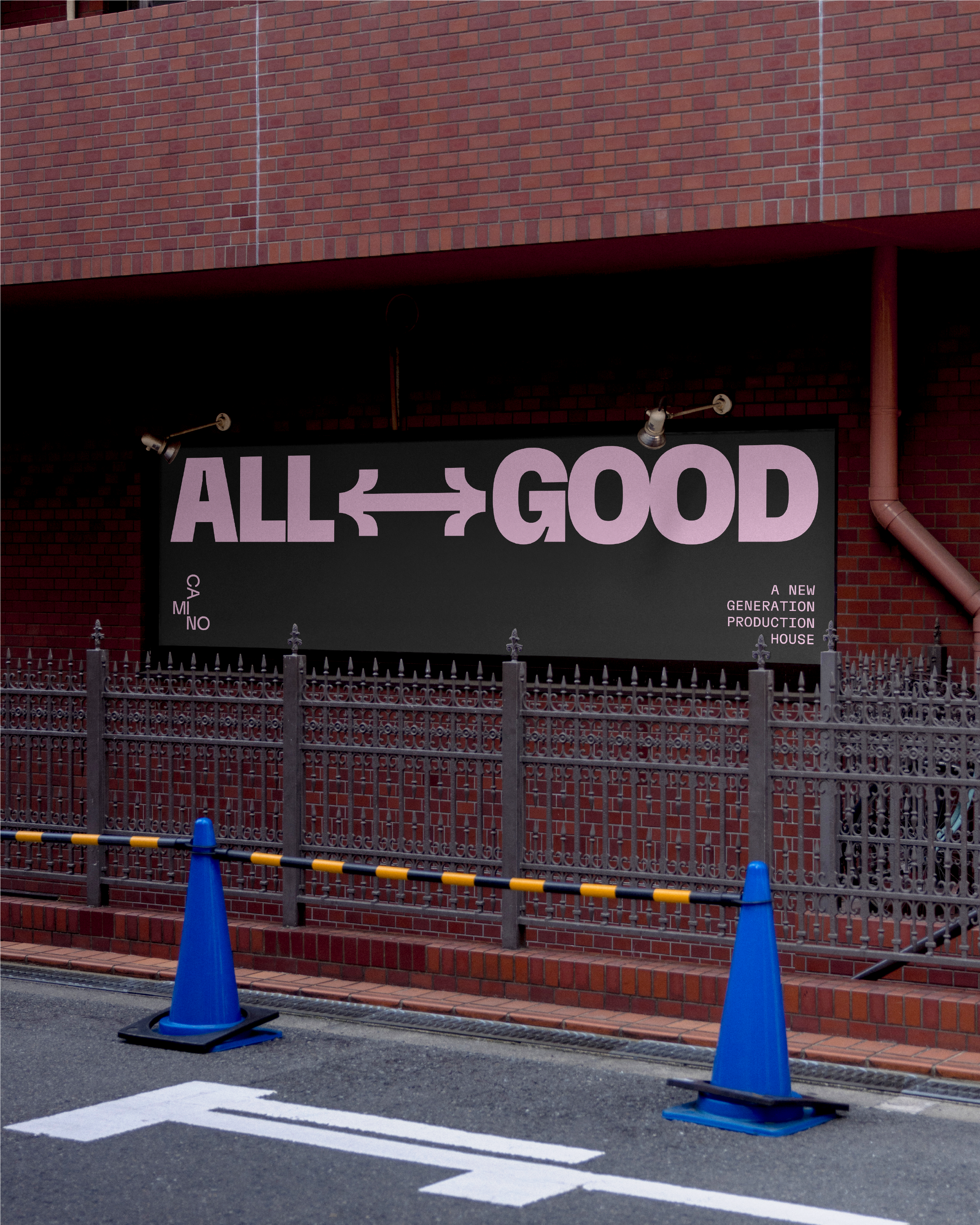
Redefining Direction: A New Identity for Camino Films.
Camino is a production company known for its cinematic approach, precise editing, and strong visual storytelling. Their work combines aesthetic sensitivity with conceptual clarity, making them a trusted partner across advertising, documentary, and branded content projects.
Our mission here was to redefine Camino’s identity in a way that felt both current and true to their essence. Through a complete rebranding, we introduced a new typographic system, a more refined color palette, and a visual language centered around arrows — symbols of movement, direction, and storytelling. The result is a brand that feels clearer, more confident, and aligned with the cinematic quality of their work.


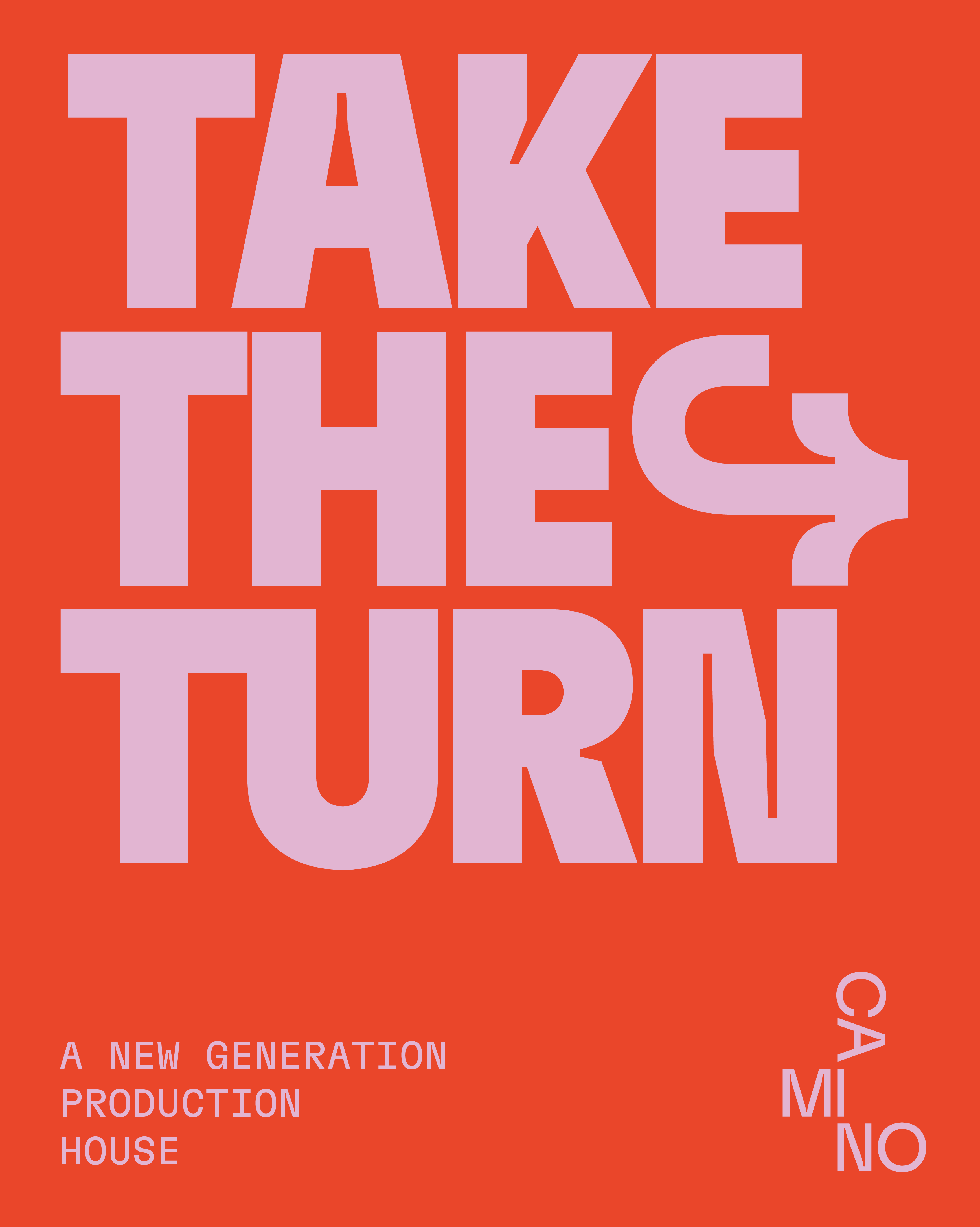
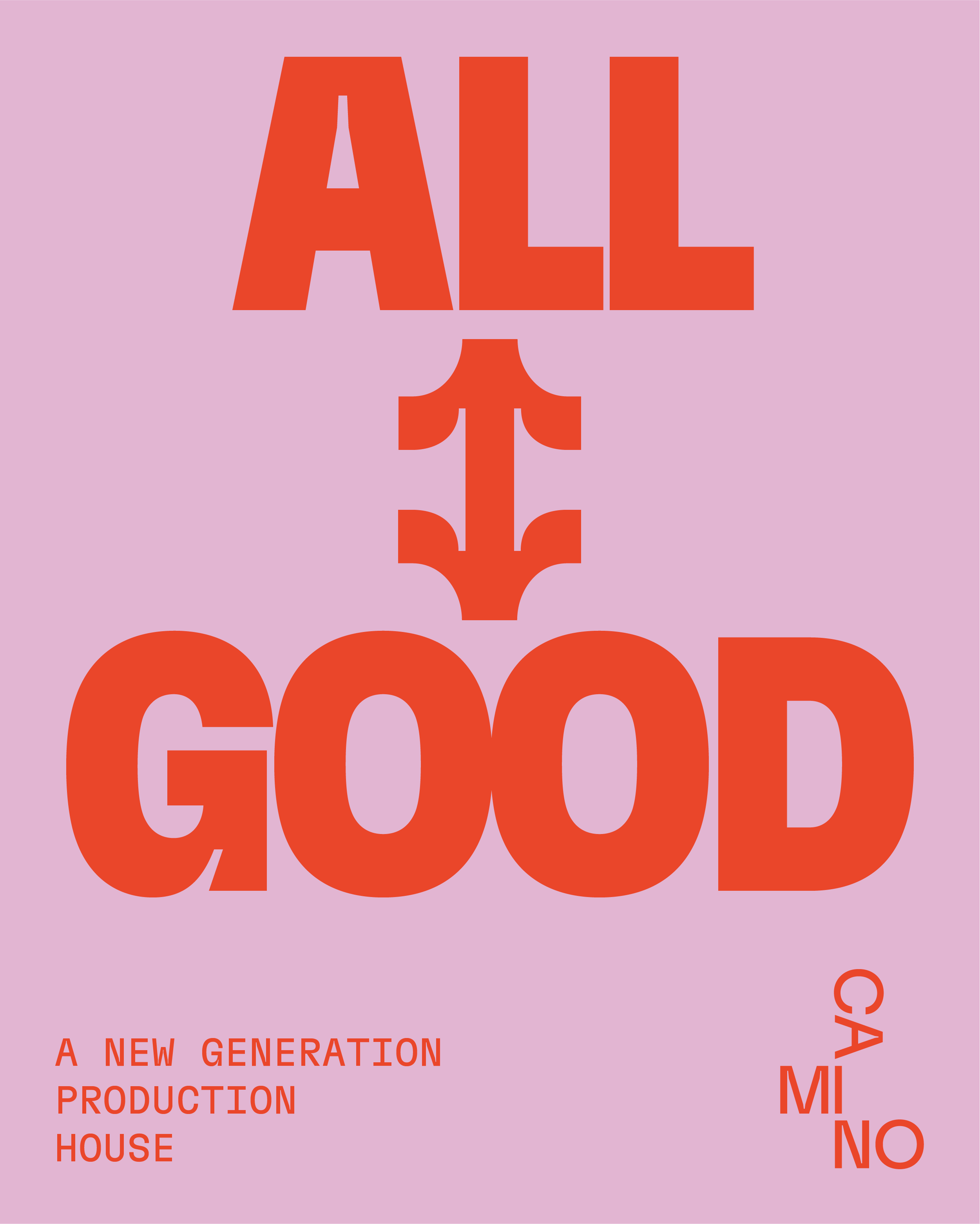
Arrows, built into the typeface, add a unique touch—symbolizing direction and movement, they help shape a stronger, more dynamic visual language.