Keyrole
Client: Keyrole
Service: Branding
Art Direction: Corvina i Turbot
Redefining Direction: A New Identity
for Keyrole.
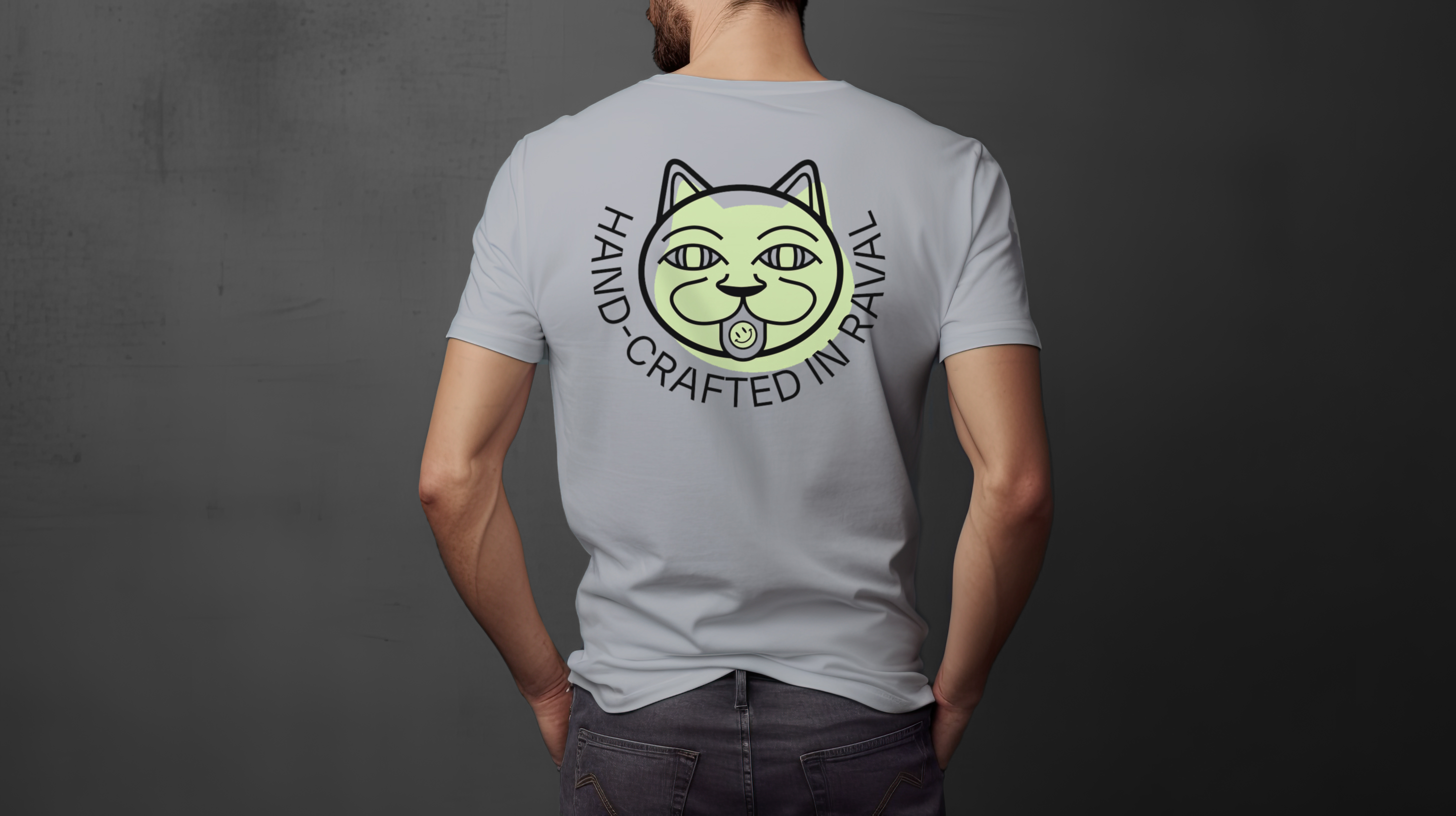
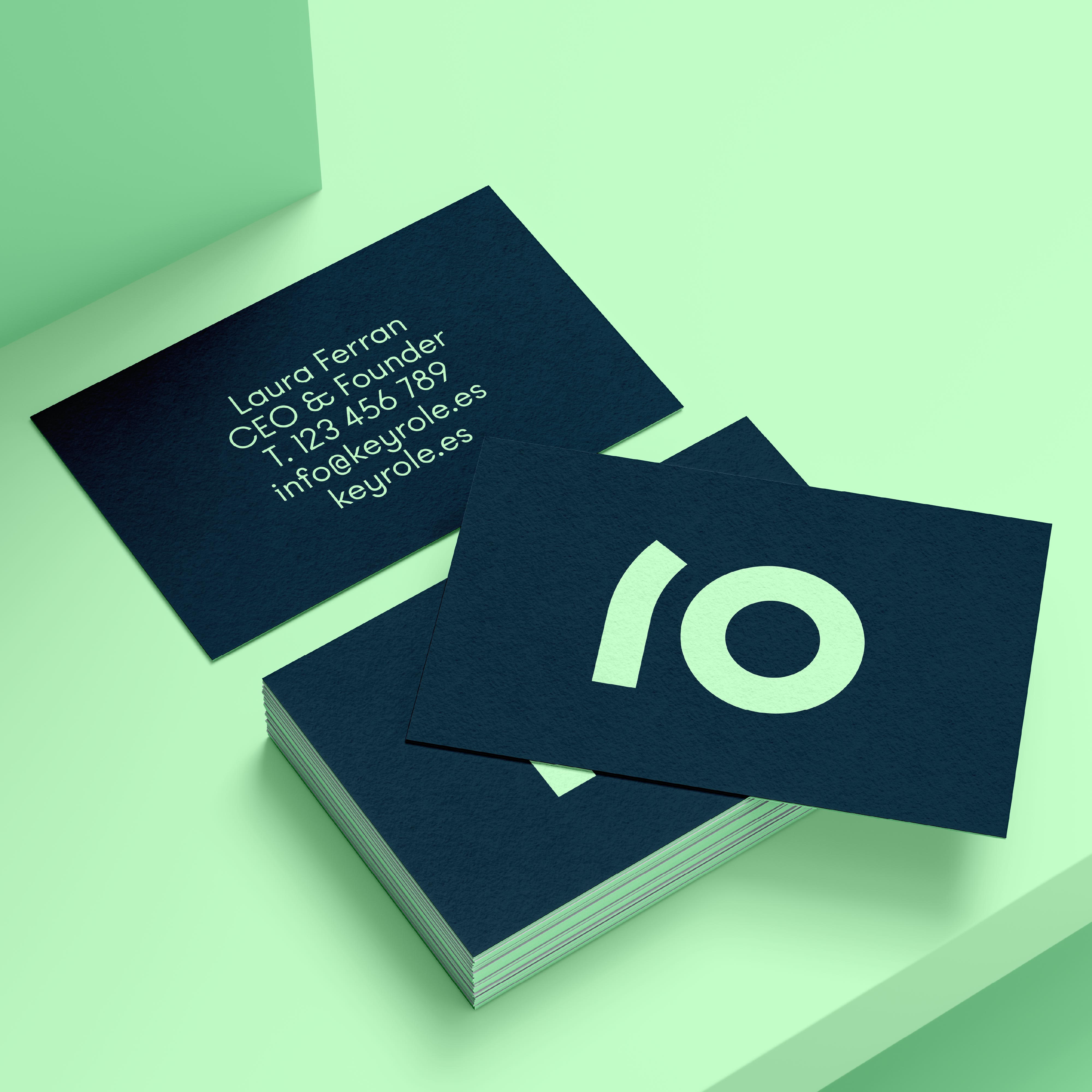
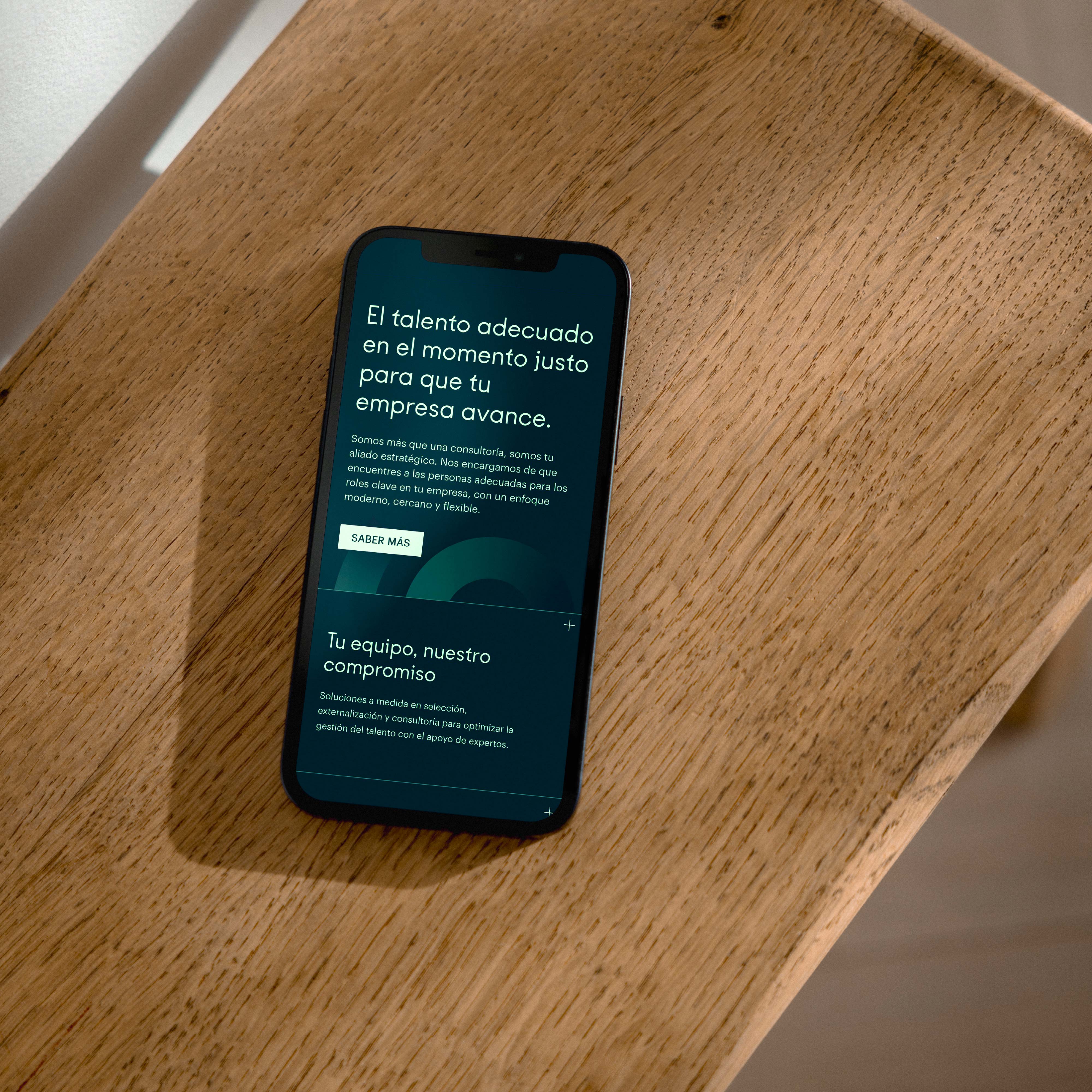
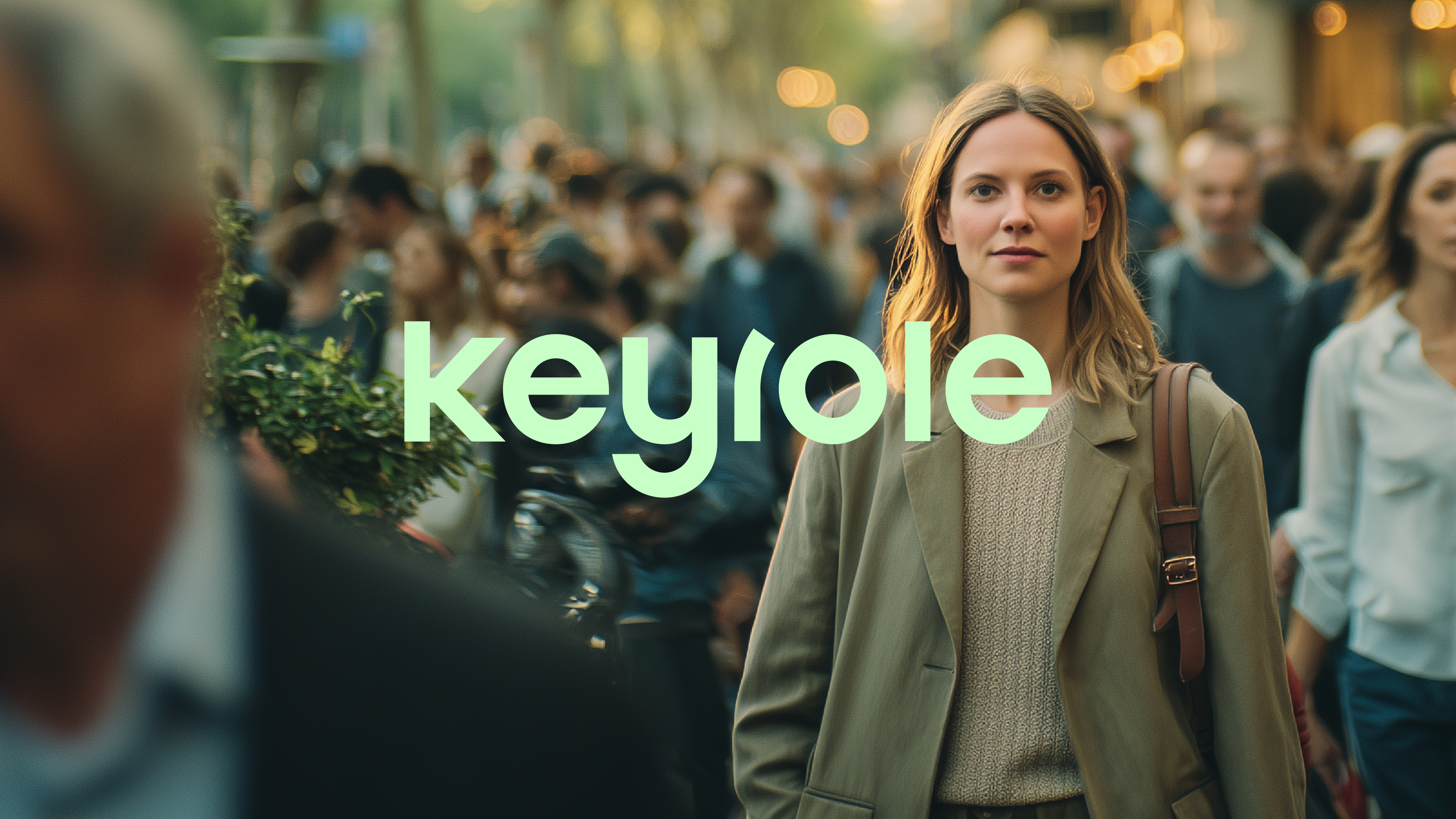
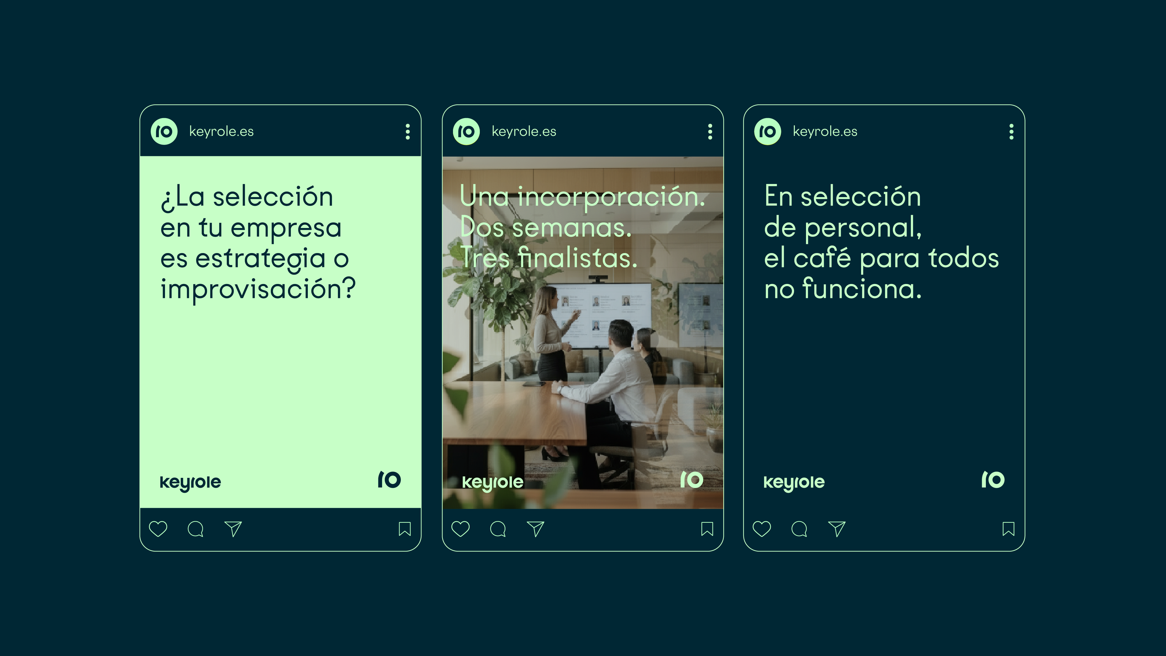
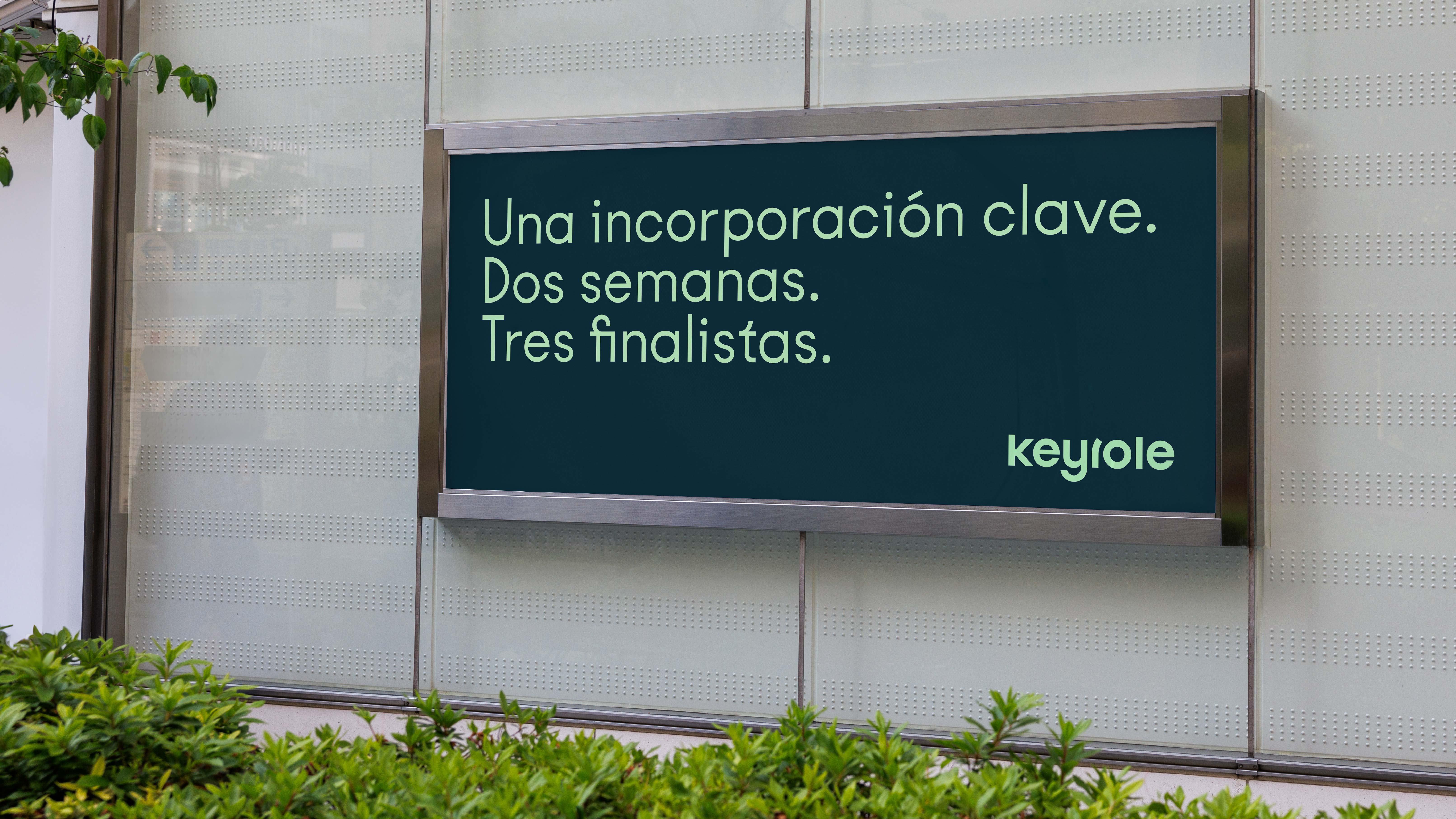
KeyRole is a people and talent partner that combines a human approach with strategic precision. Their work begins with understanding both organizations and individuals — identifying the soft skills that truly make a difference, building teams that thrive, and delivering recruitment, training, and consulting solutions that create real impact.
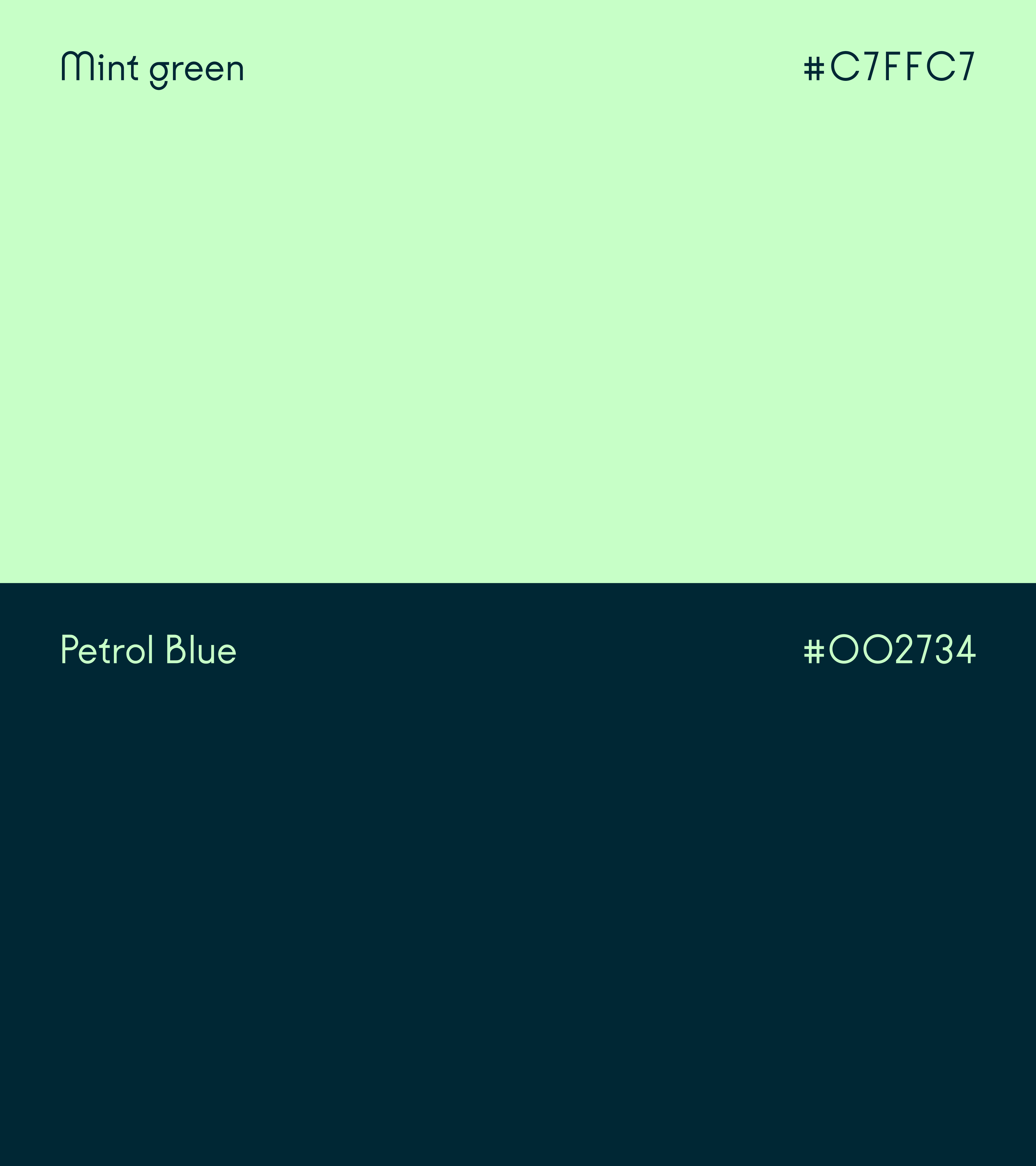
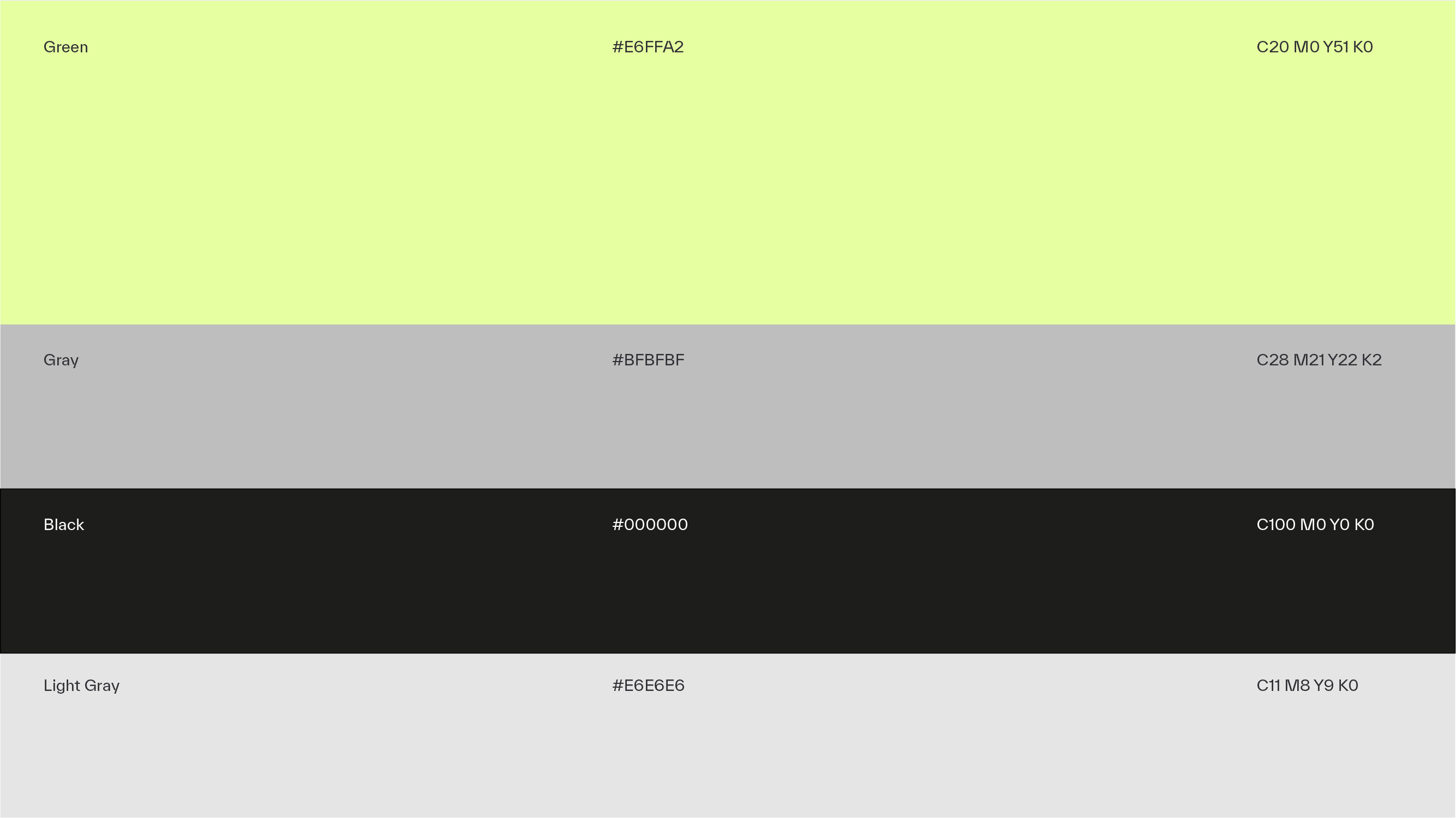
The goal was to shape an identity that feels fresh, approachable, and human — yet grounded in results and a strong sense of excellence. Through a complete rebranding, a new typographic system, a cleaner and more contemporary color palette, and a visual language built around connection, evolution, and growth were introduced — a network of lines and nodes that symbolize how people and opportunities come together.
The result is a brand that feels more connected to talent, more relevant to companies, and more aligned with the strategic quality of KeyRole’s work.


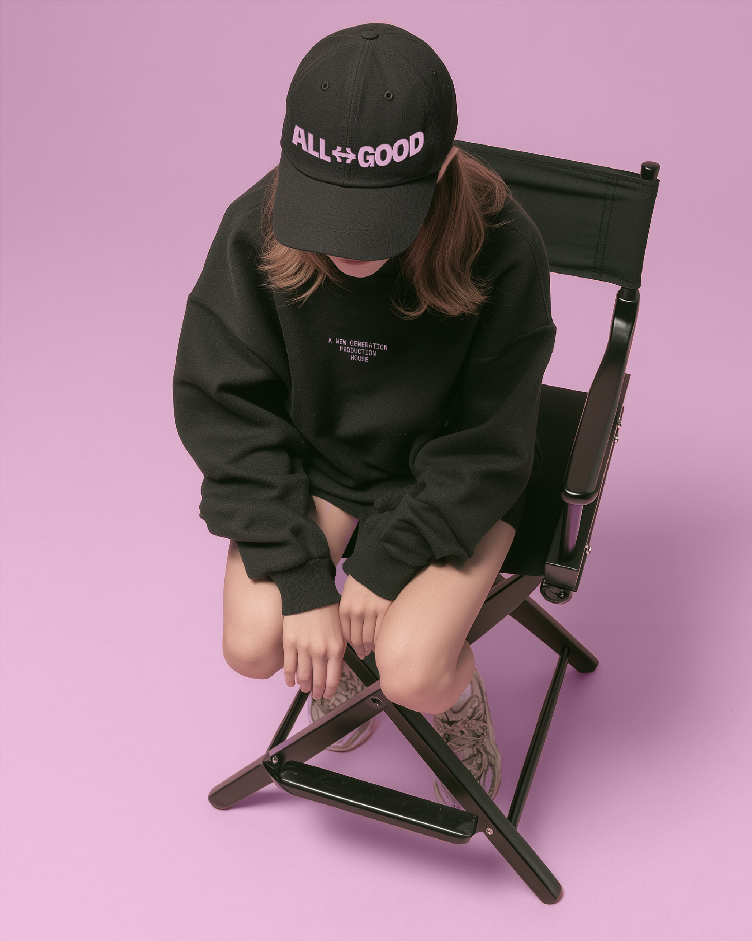
Camino Films
Client: Camino Films
Service: Rebranding
Art Direction: Corvina i Turbot
Creative Direction: Laura Diez
Redefining Direction: A New Identity for Camino Films.
Camino is a production company known for its cinematic approach, precise editing, and strong visual storytelling. Their work combines aesthetic sensitivity with conceptual clarity, making them a trusted partner across advertising, documentary, and branded content projects.
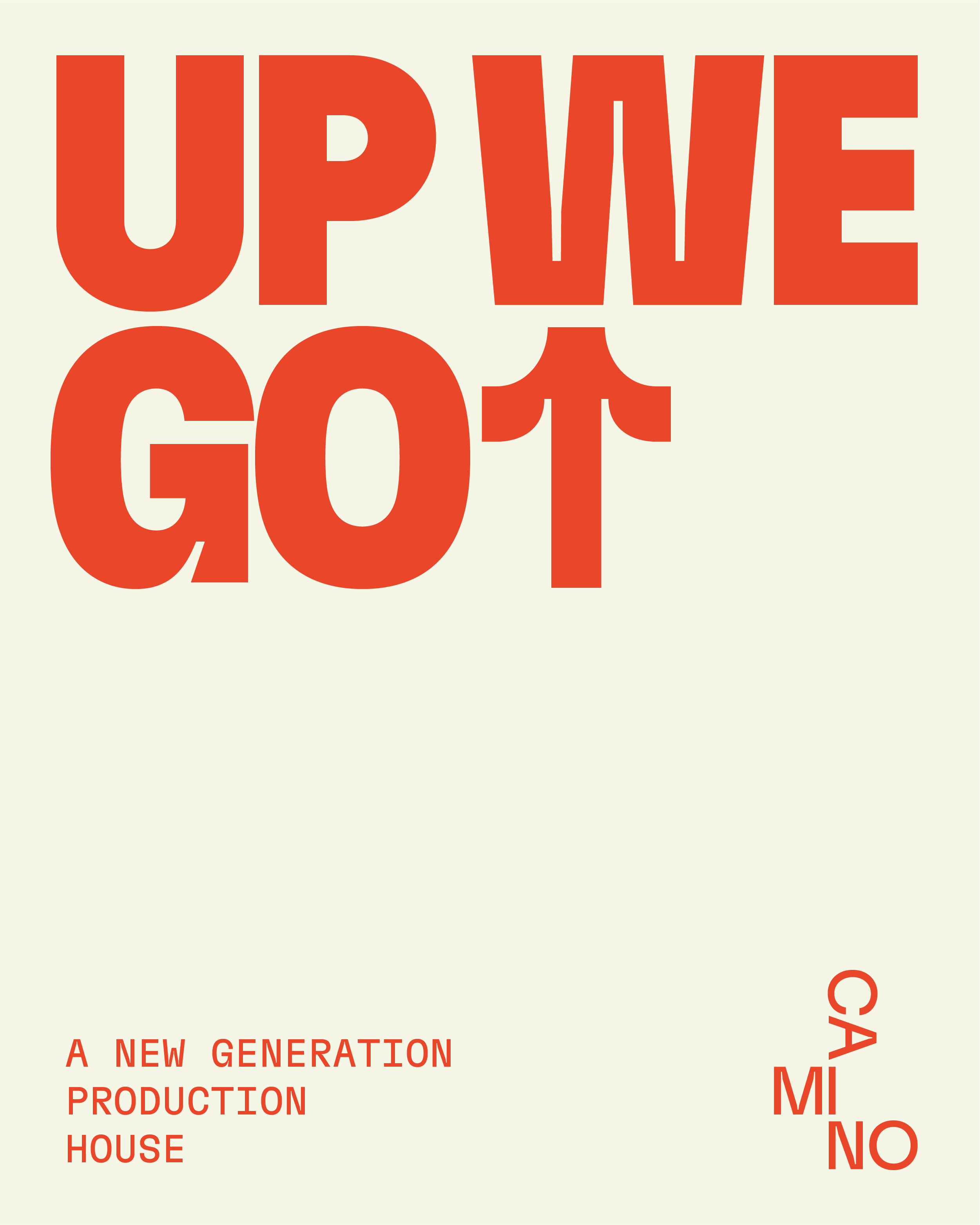
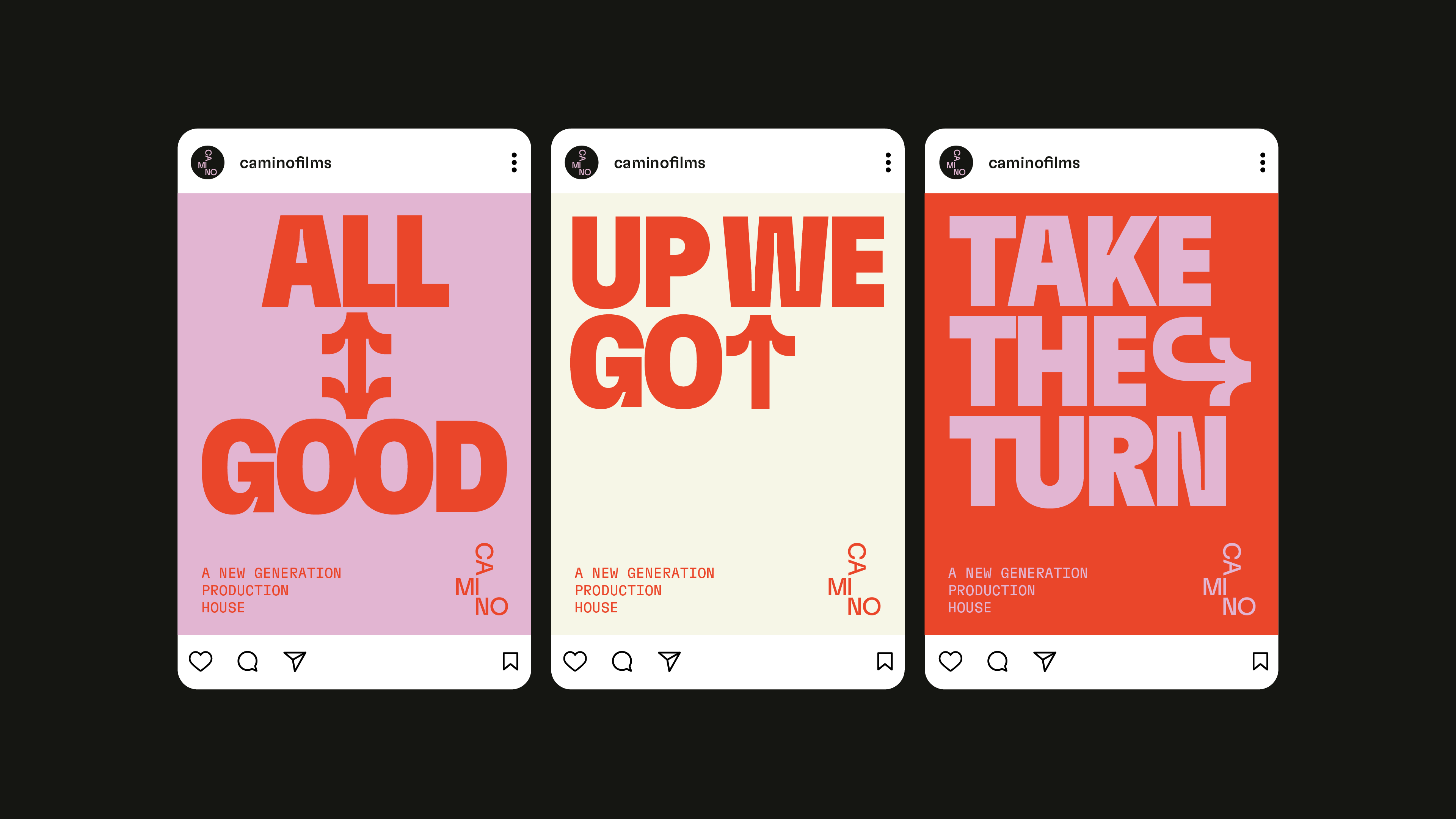
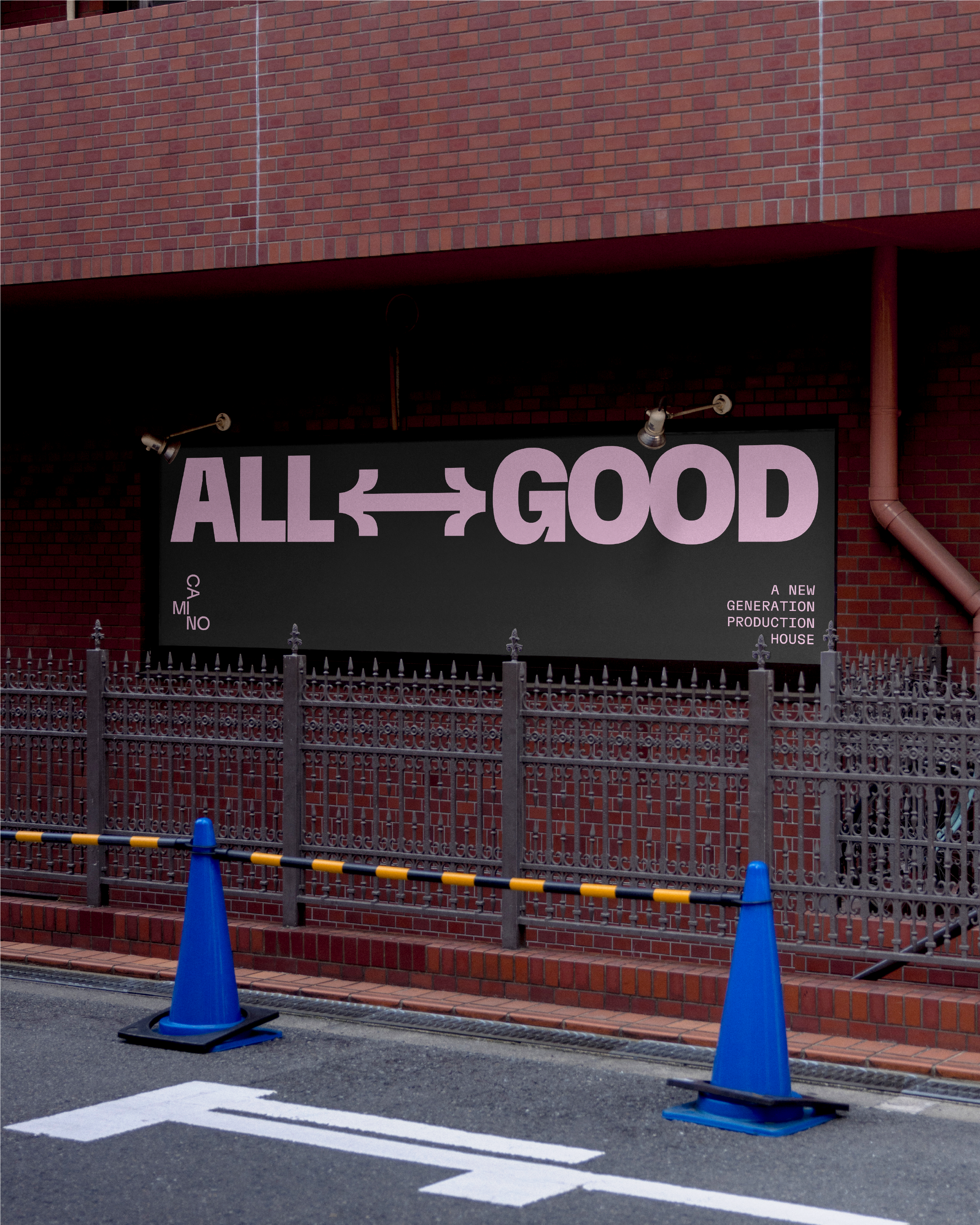
Our mission here was to redefine Camino’s identity in a way that felt both current and true to their essence. Through a complete rebranding, we introduced a new typographic system, a more refined color palette, and a visual language centered around arrows — symbols of movement, direction, and storytelling. The result is a brand that feels clearer, more confident, and aligned with the cinematic quality of their work.


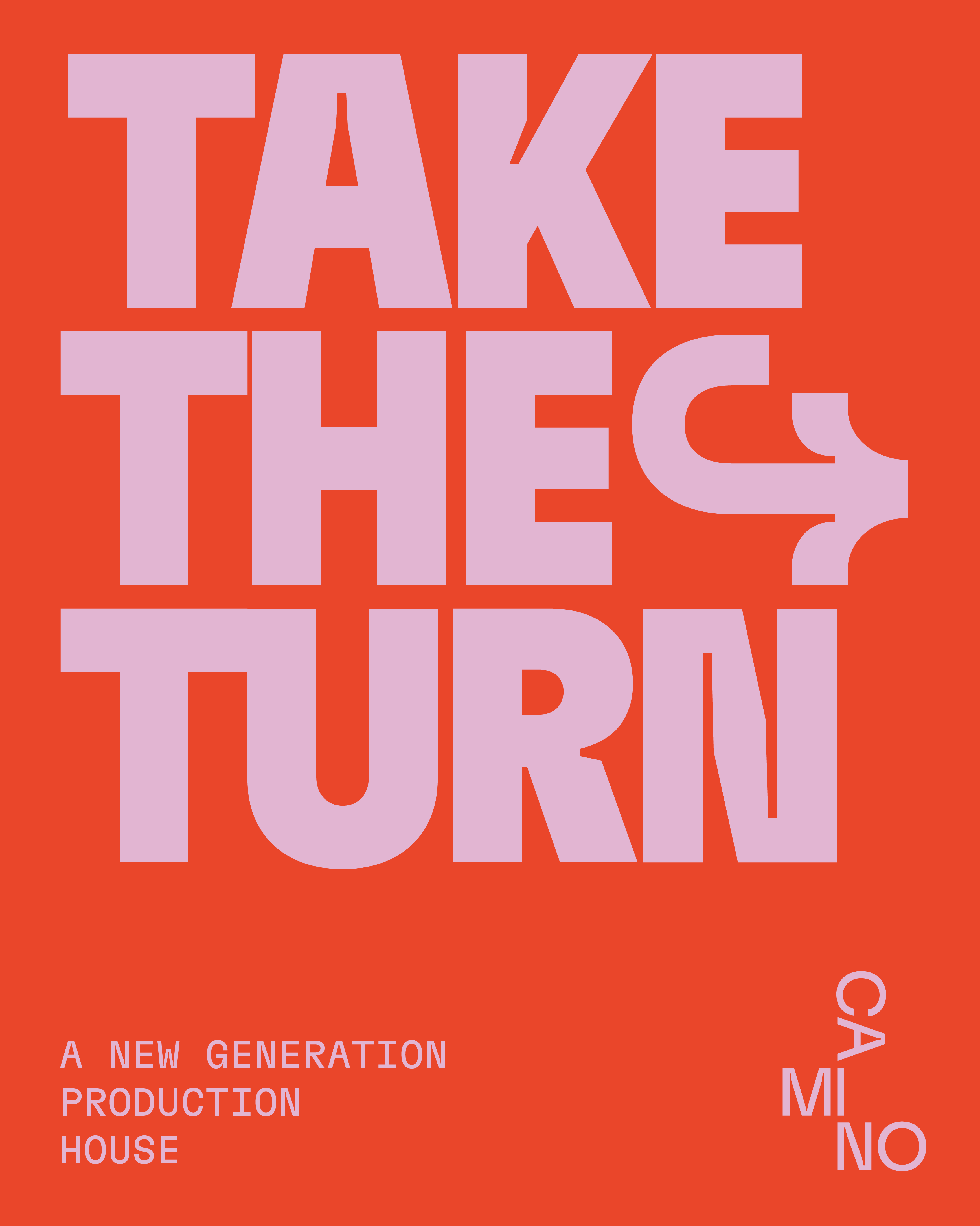
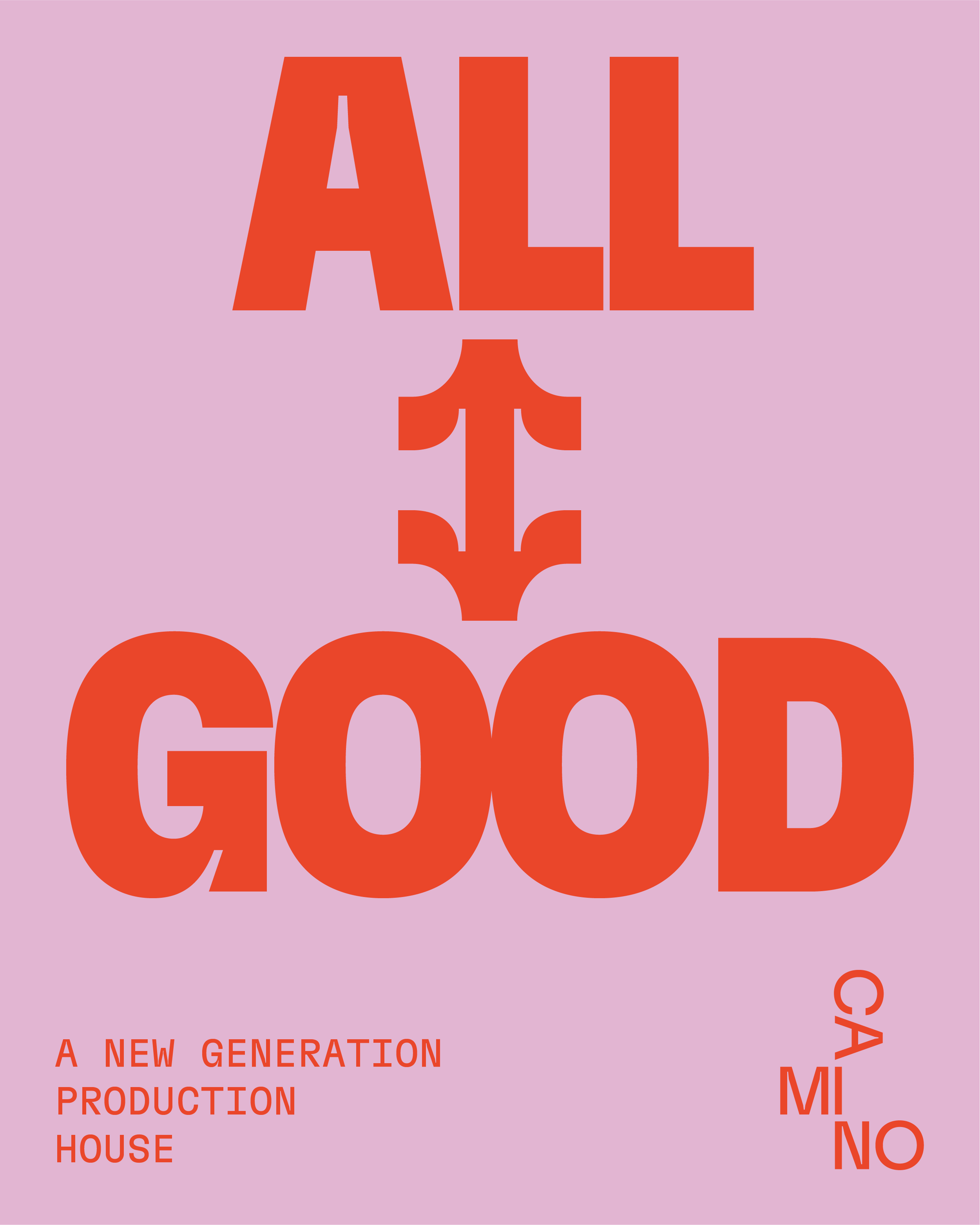
Arrows, built into the typeface, add a unique touch—symbolizing direction and movement, they help shape a stronger, more dynamic visual language.


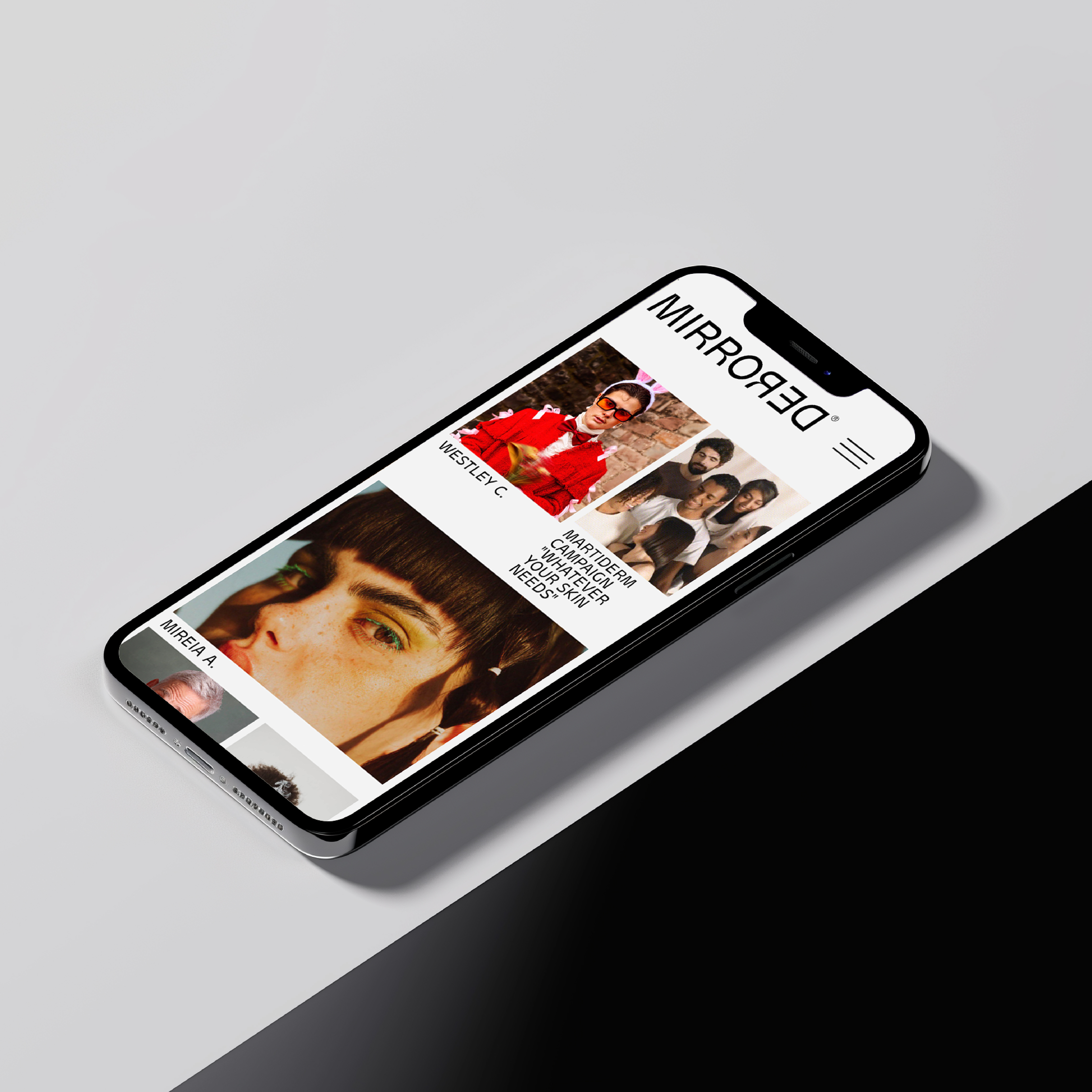
Mirrored®
Client: Mirrored®
Service: Branding
Art Direction: Corvina i Turbot
Creative Direction: Corvina i Turbot
Mirrored®: Elevating Brands, Reflecting Society.
Mirrored®, is an agency based in Barcelona specializing in identifying and nurturing the finest local talents. They tailors its offerings to suit the specific needs of businesses, brands, production companies, and casting directors.
Mirrored boasts a diverse pool of talent, including models, actors, and presenters, ready to captivate your audience and elevate your campaign.
Our role in this creative partnership was to develope the branding with a clear starting point: We want to be a reflection of the society. We are the reflection not the mirror.


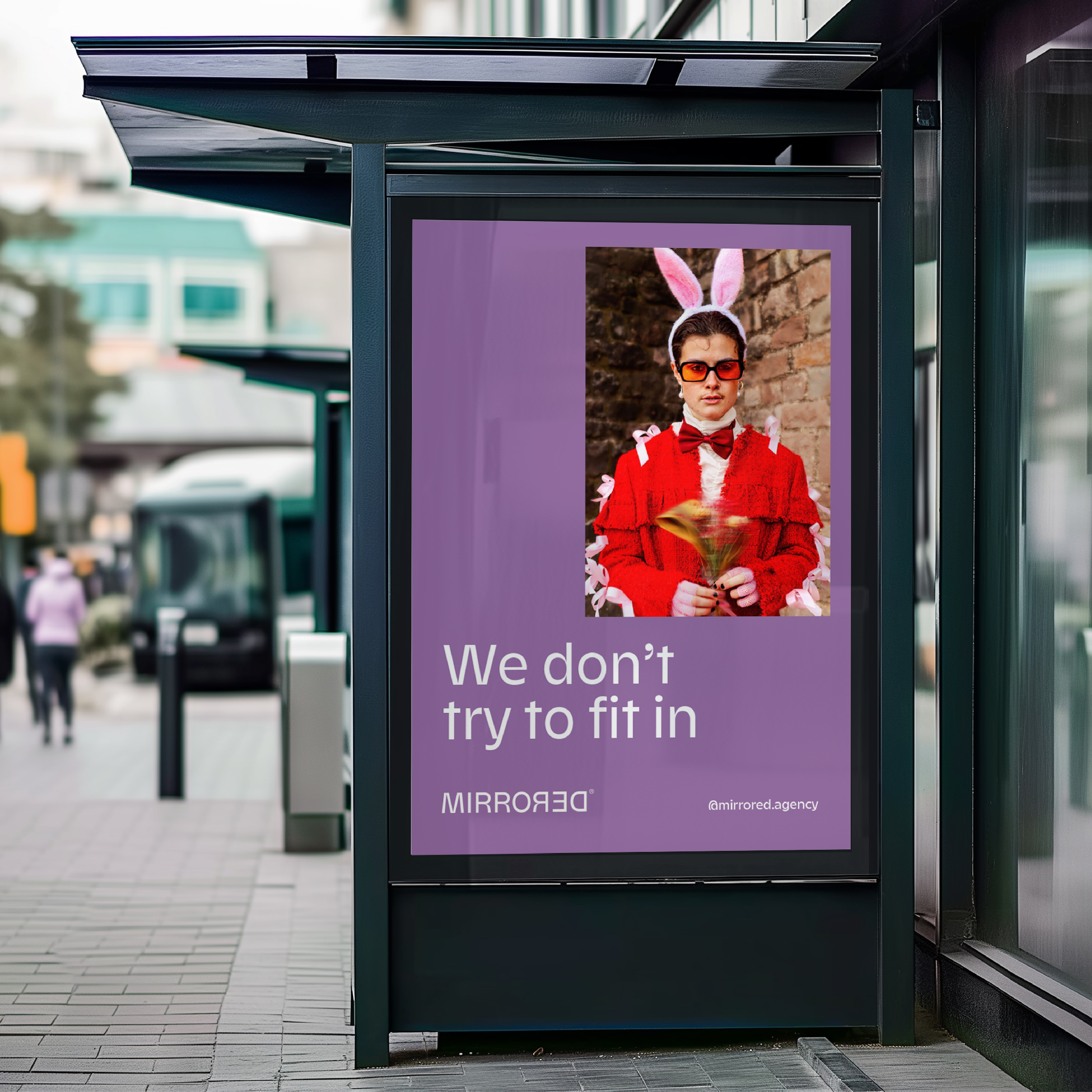

“We are very happy with how Corvina i Turbot portrayed the essence of our project. Using their creativity, they were able to convey our vision in a unique and personal way. Our initial contact with them helped us to consolidate our idea, and they assisted us throughout the entire process, from concept to materialisation.”
Álvaro Vicente
Co-Founder & CEO MIRRORED®
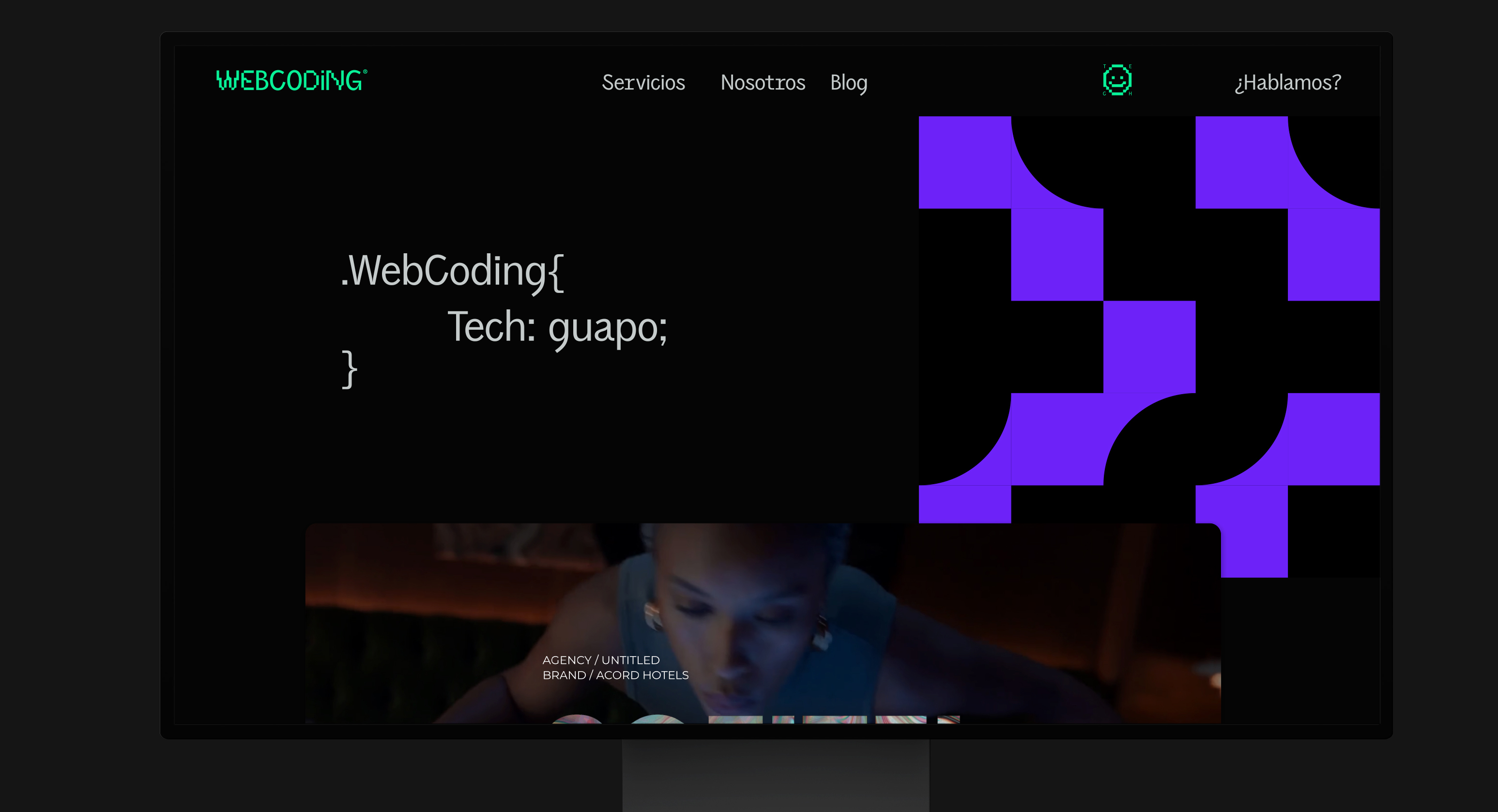
WebCoding
Client: WebCoding
Service: Branding, Web design
Art Direction: Corvina i Turbot
Creative Direction: Corvina i Turbot
Transforming ideas into digital solutions that drive businesses forward.
WebCoding doesn’t just create websites; they are digital architects, building impactful and innovative solutions across a broad spectrum of digital services. Their expertise lies in designing experiences that are not only functional but also inspire and surpass expectations. With a passion for elegant minimalism, intelligent interaction, and efficiency in every line of code, WebCoding pushes beyond traditional digital boundaries.
WebCoding embodies collaboration and a commitment to digital excellence, turning ideas into realities that shape the future across web development, digital strategy, and more.


"Partnering with Corvina i Turbot® was a game-changer for us. Their approach was thoughtful and tailored, making sure to understand our goals from the ground up. They brought fresh ideas to the table, guiding us every step of the way. The final result exceeded our expectations, and we’re beyond satisfied with what they delivered!"
Dani Donaire
Founder & CEO WebCoding

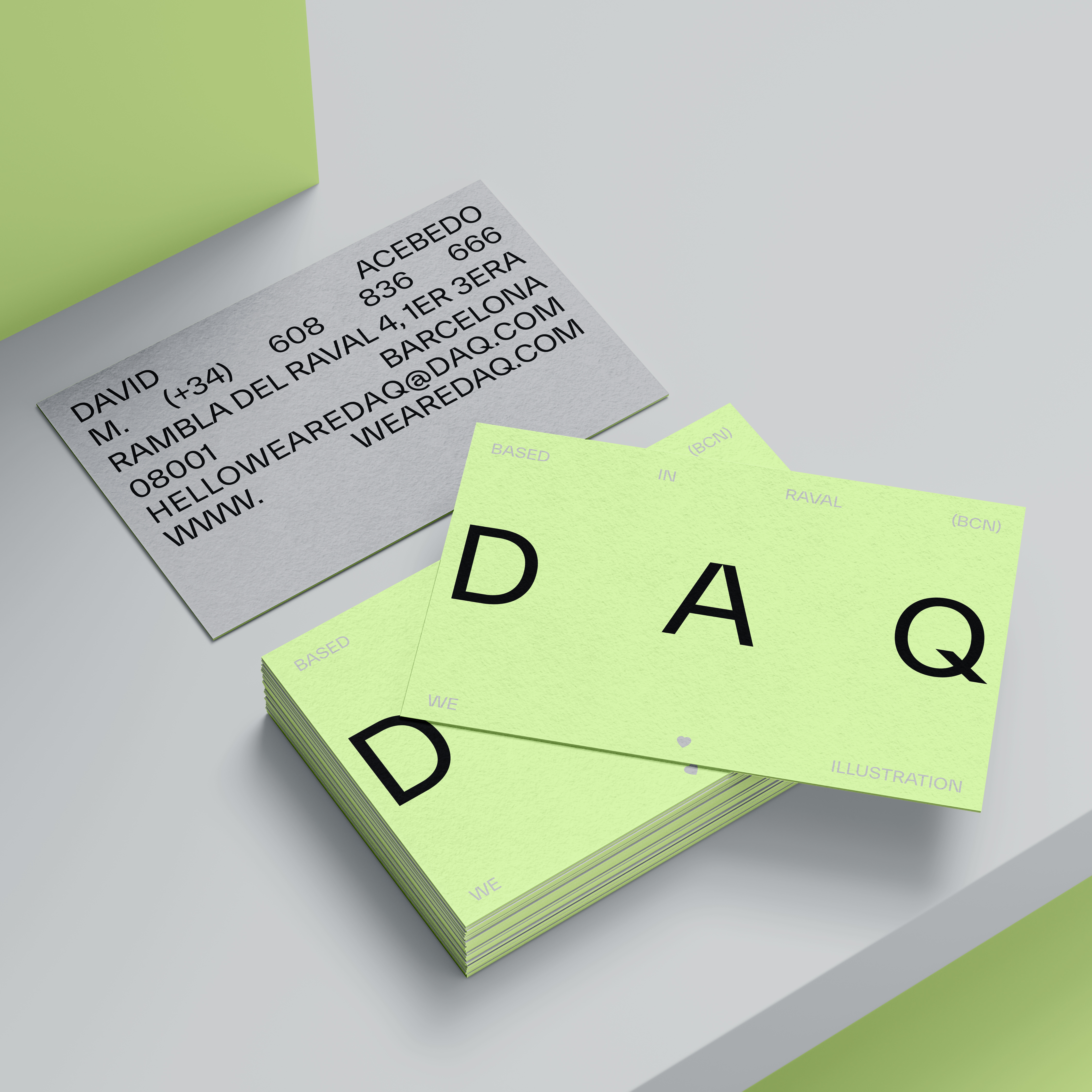
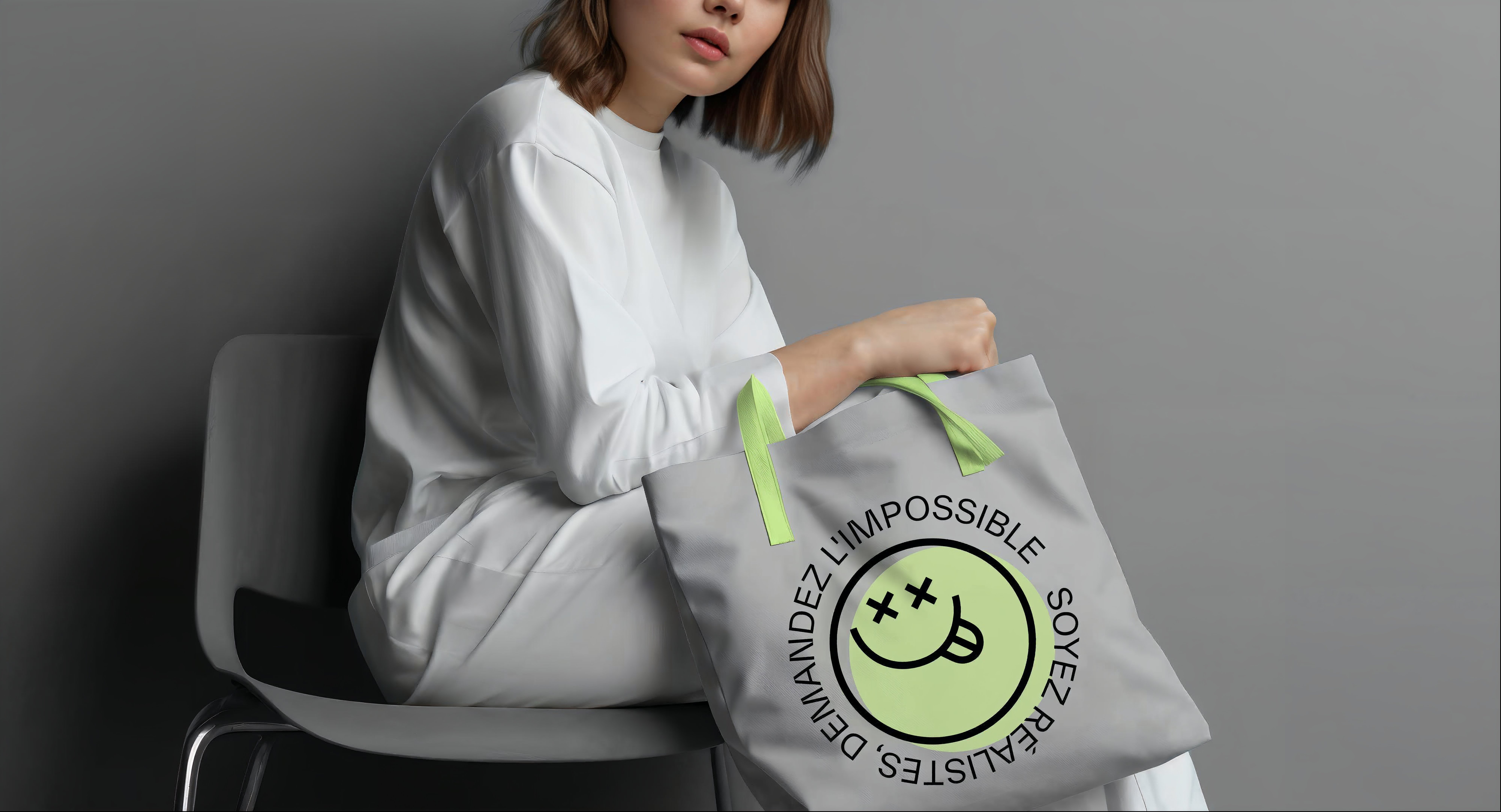
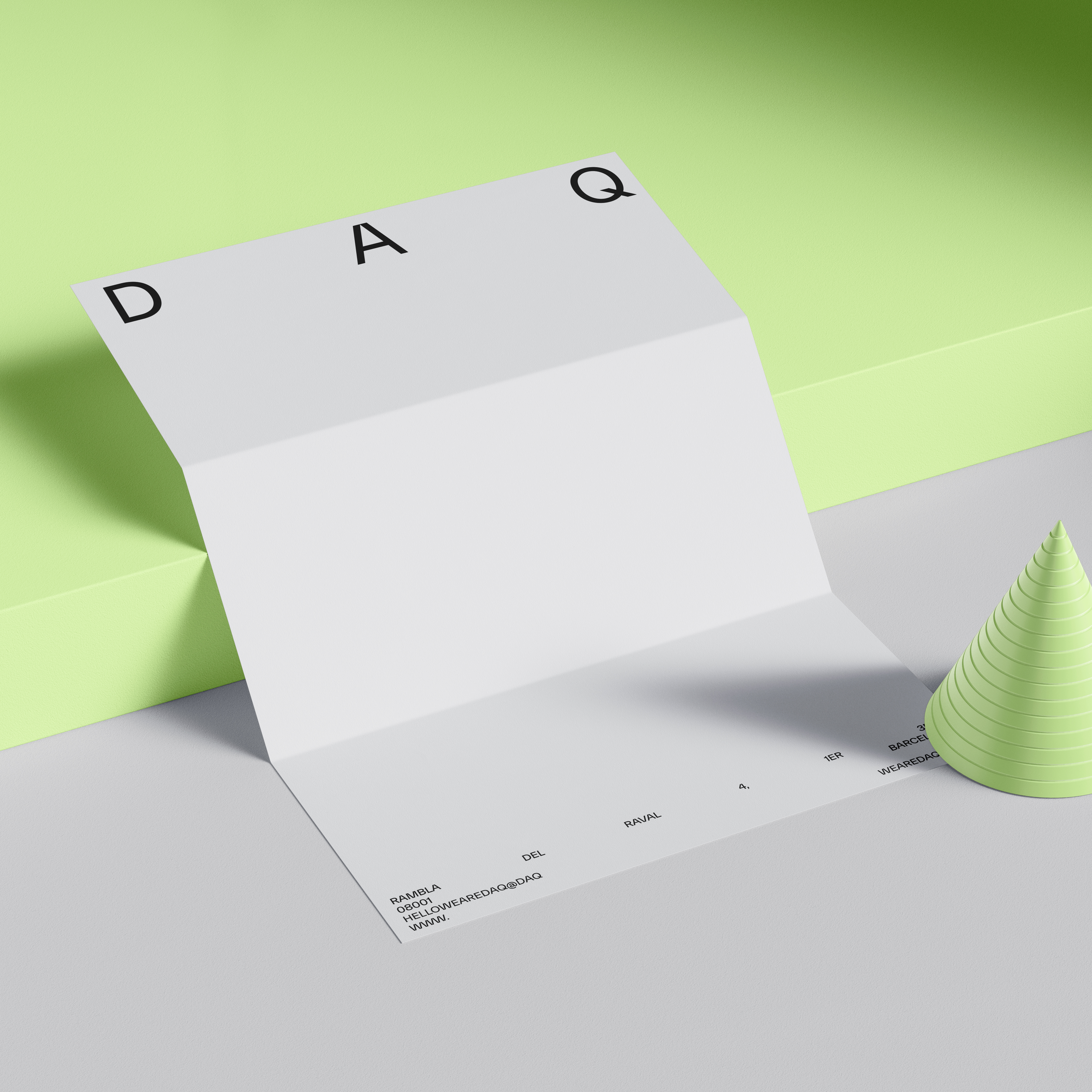
DAQ
Client: DAQ
Service: Branding, Web design
Art Direction: DAQ & Corvina i Turbot
Creative Direction: DAQ & Corvina i Turbot
Web Development: Cactus
Sticker Animations: Joan Thelorious
Beyond Boundaries: Crafting DAQ's Dynamic Branding and Digital Showcase from Barcelona to the World.
DAQ goes beyond the conventional; they are visual storytellers who breathe life into their narratives. Their specialization lies in crafting imagery that not only captivates but also provokes thought. Their love for geometry, volumetric shapes, and the play of contrasting colors forms the cornerstone of their unique style. With DAQ, creativity knows no boundaries as they dive into illusions and the surreal, experimenting with volumes and impossible shapes.
Situated in the vibrant city of Barcelona, DAQ is the brainchild of David Acevedo and Anna Miracle. Their creative journey is rooted in a profound sense of social responsibility, and their work is a testament to the power of collaboration and reflection.
Our role in this creative partnership was to develope the branding and a digital platform that echoes the dynamism and imagination of DAQ's ever-evolving brand.
We crafted a website that serves as a dynamic canvas for their portfolio, a space where their artistry can take center stage. Every element, from the branding to the web design, was meticulously engineered to encapsulate the ever-changing spirit of DAQ.


“Choosing Corvina i Turbot® was undoubtedly a success. We are aware that it wasn't easy... Their insightful questions from the very beginning and their guidance throughout the entire process demonstrated a genuine understanding of the essence of our needs. We are very pleased with the outcome! ”
Anna Miracle
Co-Founder & CEO DAQ